HELPING PATIENTS MANAGE CHRONIC PAIN
HELPING PATIENTS MANAGE CHRONIC PAIN
HELPING PATIENTS MANAGE CHRONIC PAIN
HELPING PATIENTS MANAGE CHRONIC PAIN
Designing Leva Clinic's Pain Management Programme
Client: Leva Clinic
My Role: Design Lead, User Experience, User Interface
Platforms: Webapp
Long story short
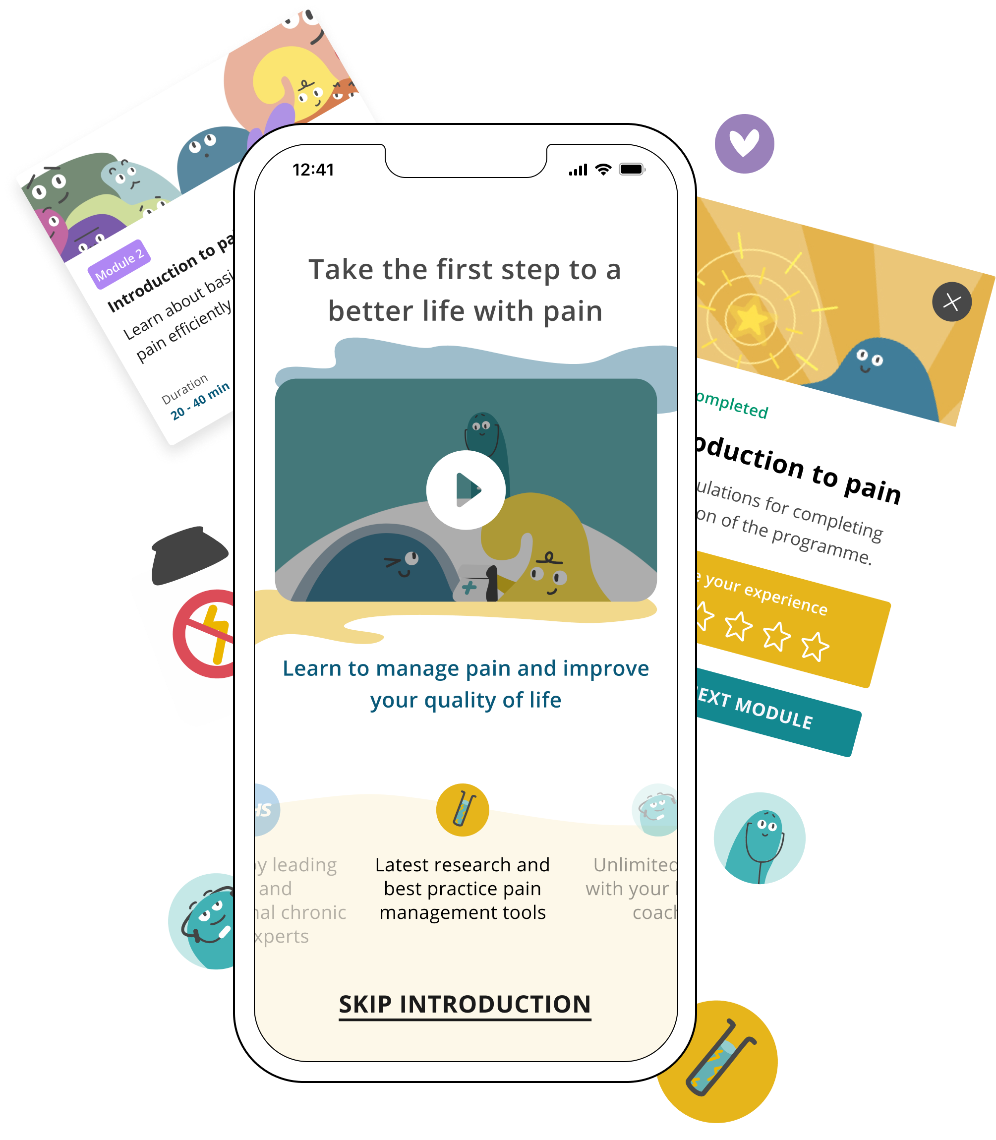
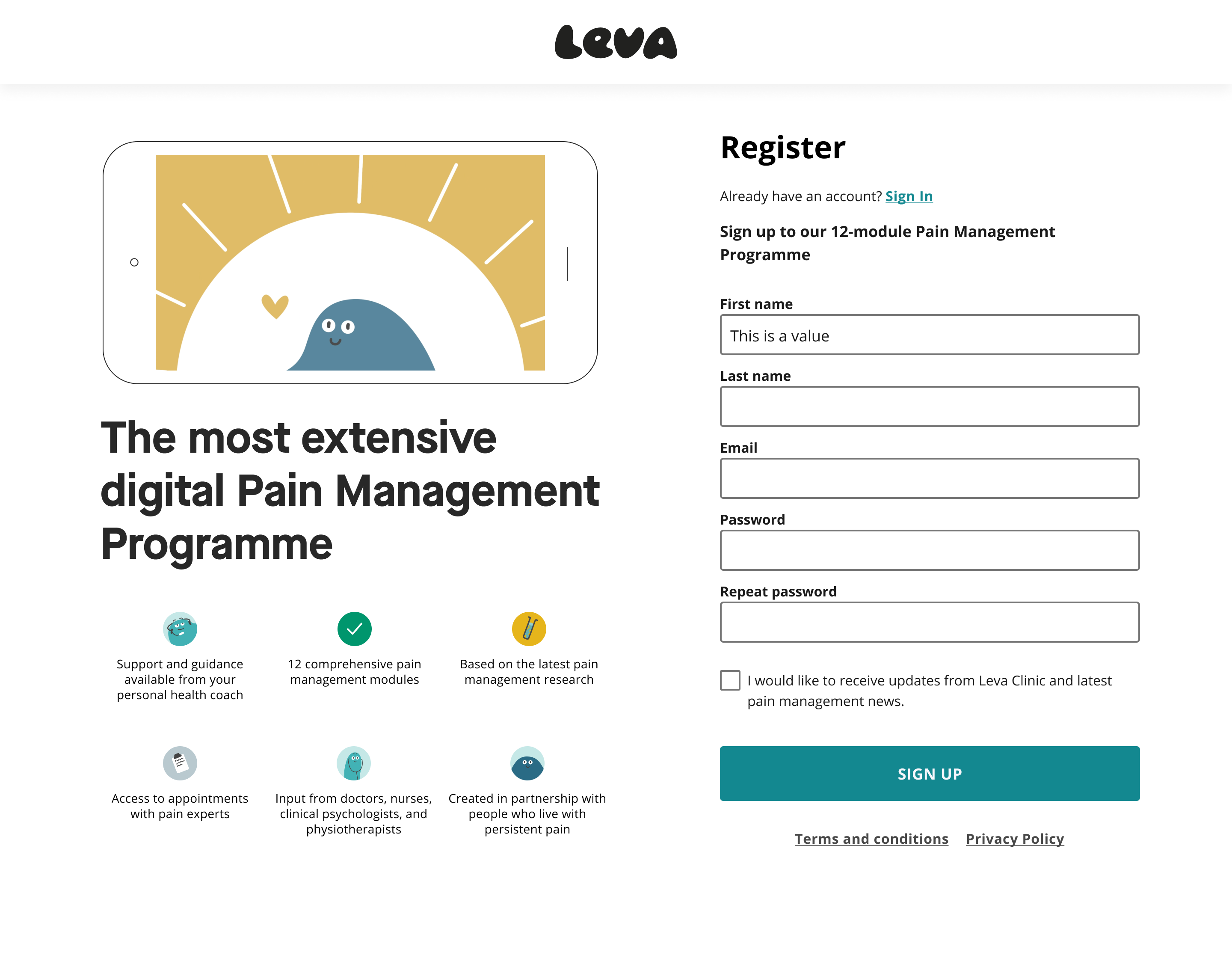
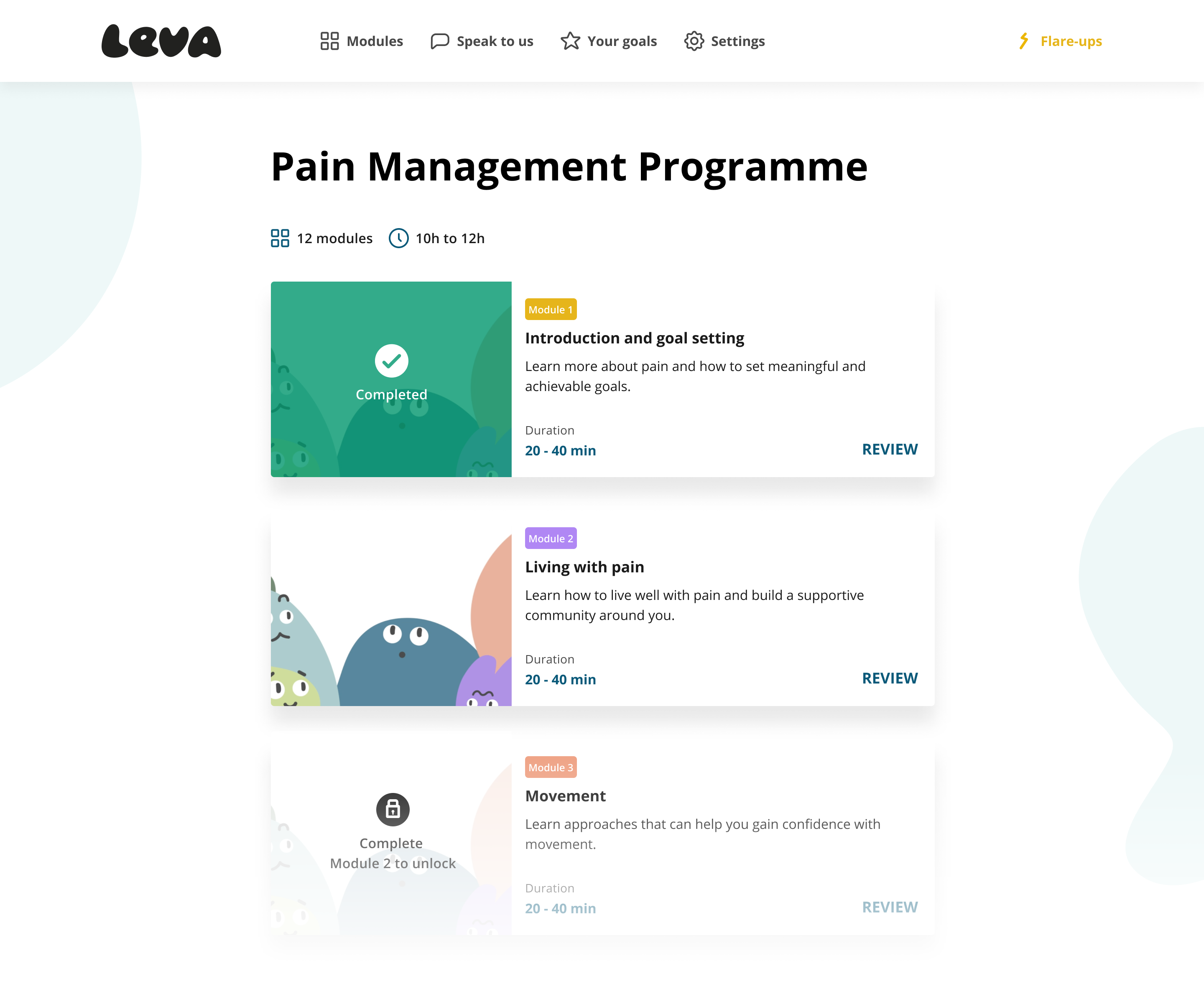
I worked with Leva clinic for 2 quarters designing and implementing their pain management program from scratch. the program includes a full 12 steps course with audio lessons and short animated videos.
But really, what did I do?
I worked through Arnaud’s (the PM) pre-made wireframes and evolved them into a full-scope product, and design system. I tested prototypes with users while working in agile sprints with Oliver (Dev) on the implementation.
Outcome
The project was fully implemented and is currently live with a growing user base.
THE PROCESS
Very, very agile
Contrary to a standard double diamond process i had to adapt to a tight implementation schedule and deliver results fast. despite not being part of the initial ideation, Arnaud made sure i have the freedom to explore and change whatever was needed according to the data we had and the vision for the product.
We agreed to conduct user interviews as fast as we can have a first version prototype and see how it goes.
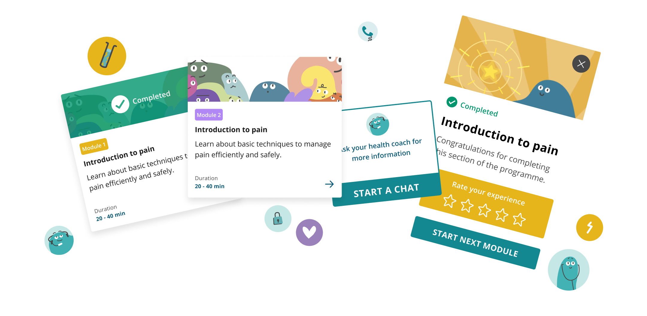
DESIGN SYSTEM DIPPED IN ANIMATION INK
When i was introduced to the product the animated videos were halfway complete, however, the concept behind the 12 characters - what they represent, their colors, and their meaning was defined by the animator (Lucie) and the content team, and I was keen on creating a mental modal for the users to anchors the meaning of each lesson’s character and their meaning to colors and shapes that appear in the animation..
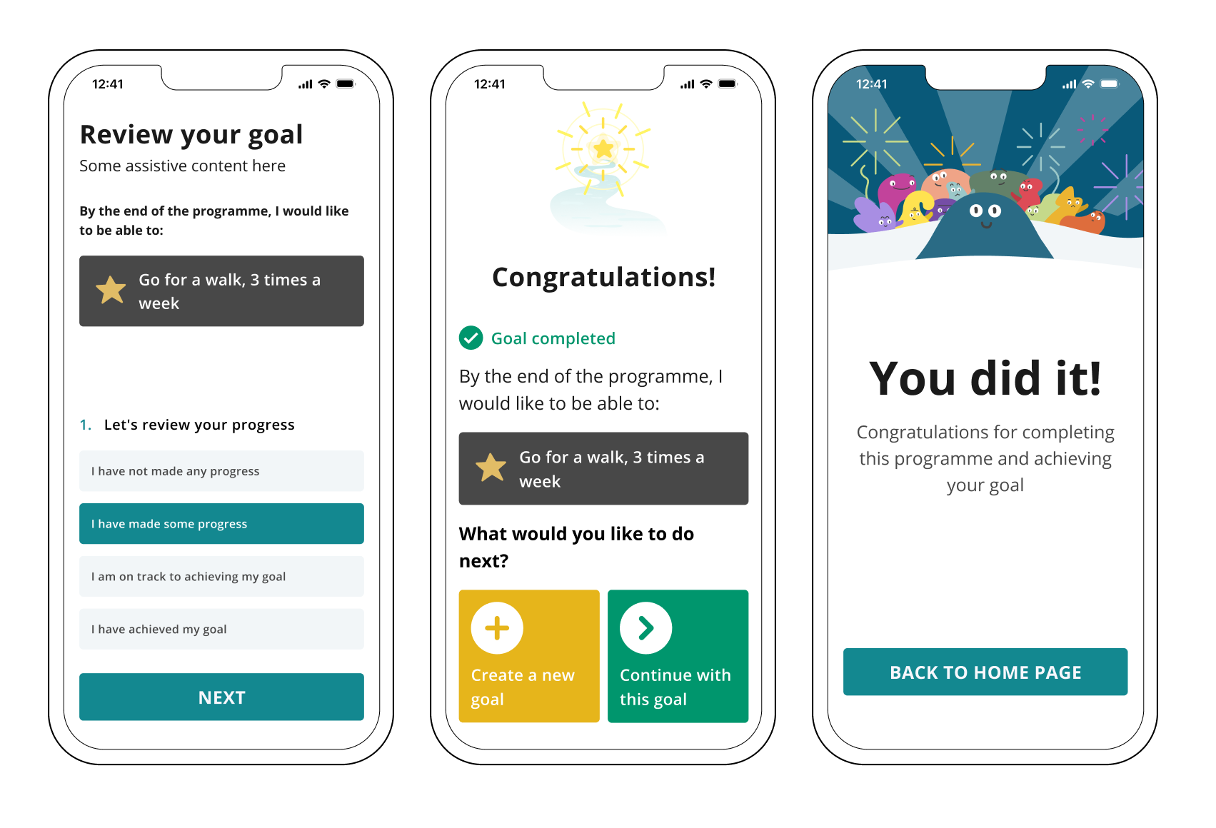
For example - For goals, which were a distinctive part of the user’s tasks in the program, we gave a certain color to create the mental modal that this is where they would find their goals and edit them after completing the Goals lesson
How do you design for people who suffer from chronic pain?
How do you design for people who suffer from chronic pain?
How do you design for people who suffer from chronic pain?
Learning about Leva’s patients and the diversity of people who suffer from chronic pain was eye-opening for me. along with taking the International Design Foundation course on accessibility i also researched for resources on accessibility and design and together with interviewing Leva’s patients we decided on several accessibility principles to be included in the design. later on, we had to make sure the implementation pass the rigorous AAA WCAG accessibility rating:
- We increased the typography sizes slightly and made sure the design is as clear and spaced out as possible
- We tested the contrast to be clear as possible and adjusted some of the colors accordingly
- We made sure our copy was simple and consistent across the app
- We had to take into consideration users who use screen readers, issues with eyesight and contrast, and more
- Text captions for audios and videos and their accessibility
This process taught me a lot about challenging the way i see users and use cases and how to approach UI design, to begin with.
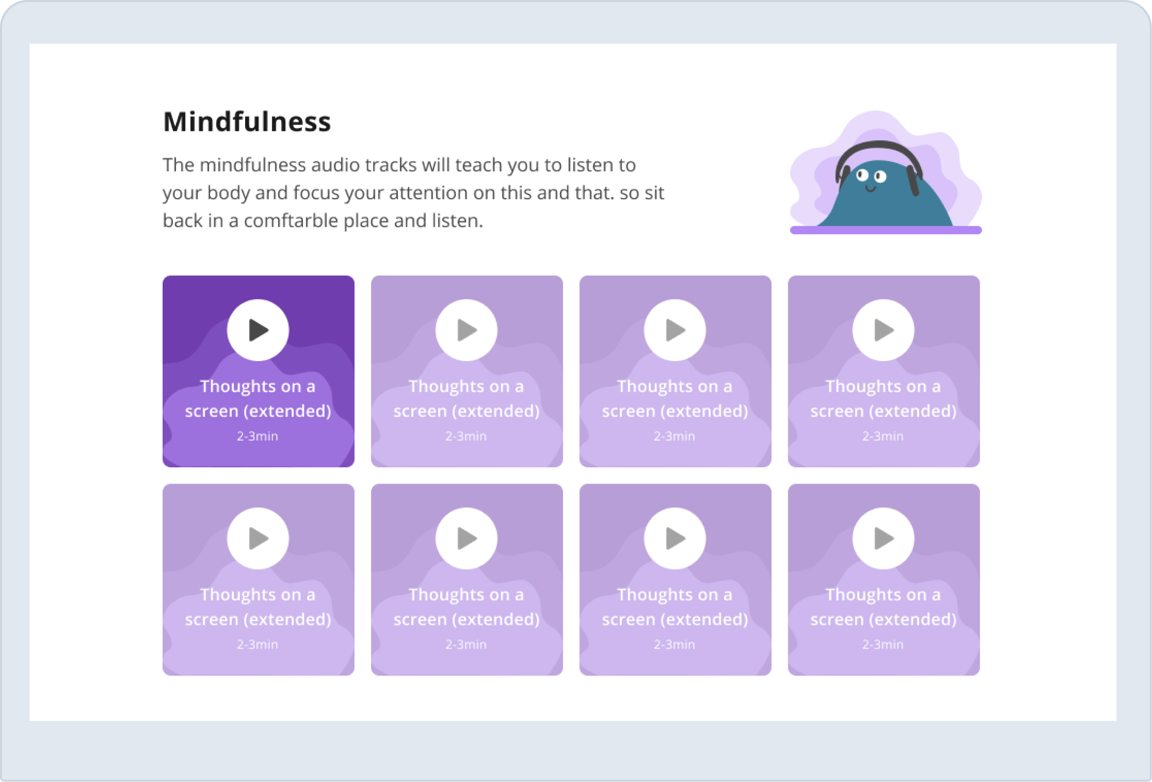
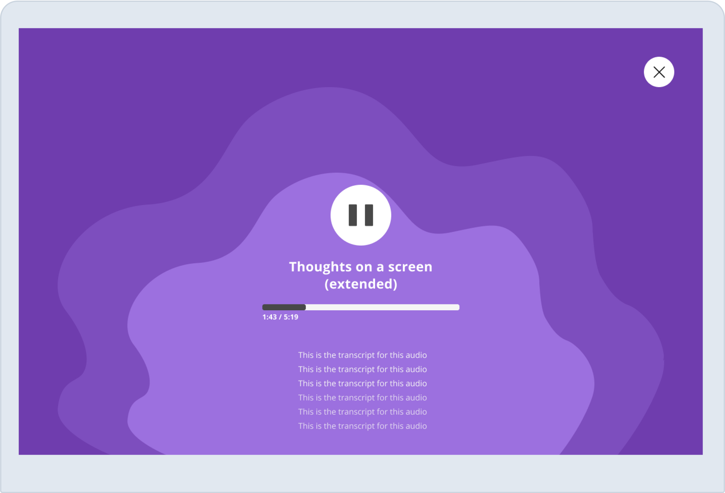
Making people focus on the moment
Besides audio lessons, the program included a lot of meditation audio to help the patients practice mindfulness techniques that are crucial to help them deal with their pain. we wanted to design an audio-playing experience that won’t distract them and allow the patients to close their eyes and focus on the meditation
Some obvious inspiration came from Headspace but I also worked with Lucie and took elements from her animations related to the mindfulness lessons and embedded them in the design to create a sense of calmness and delight
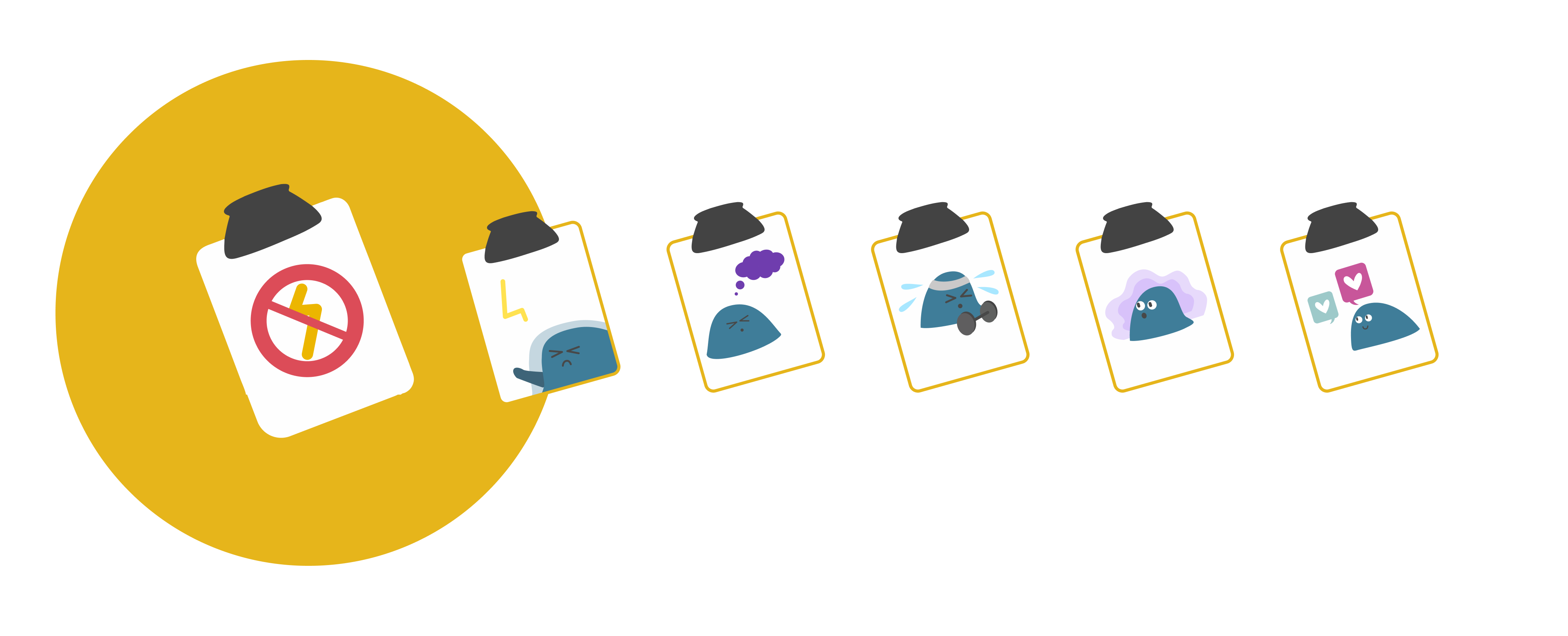
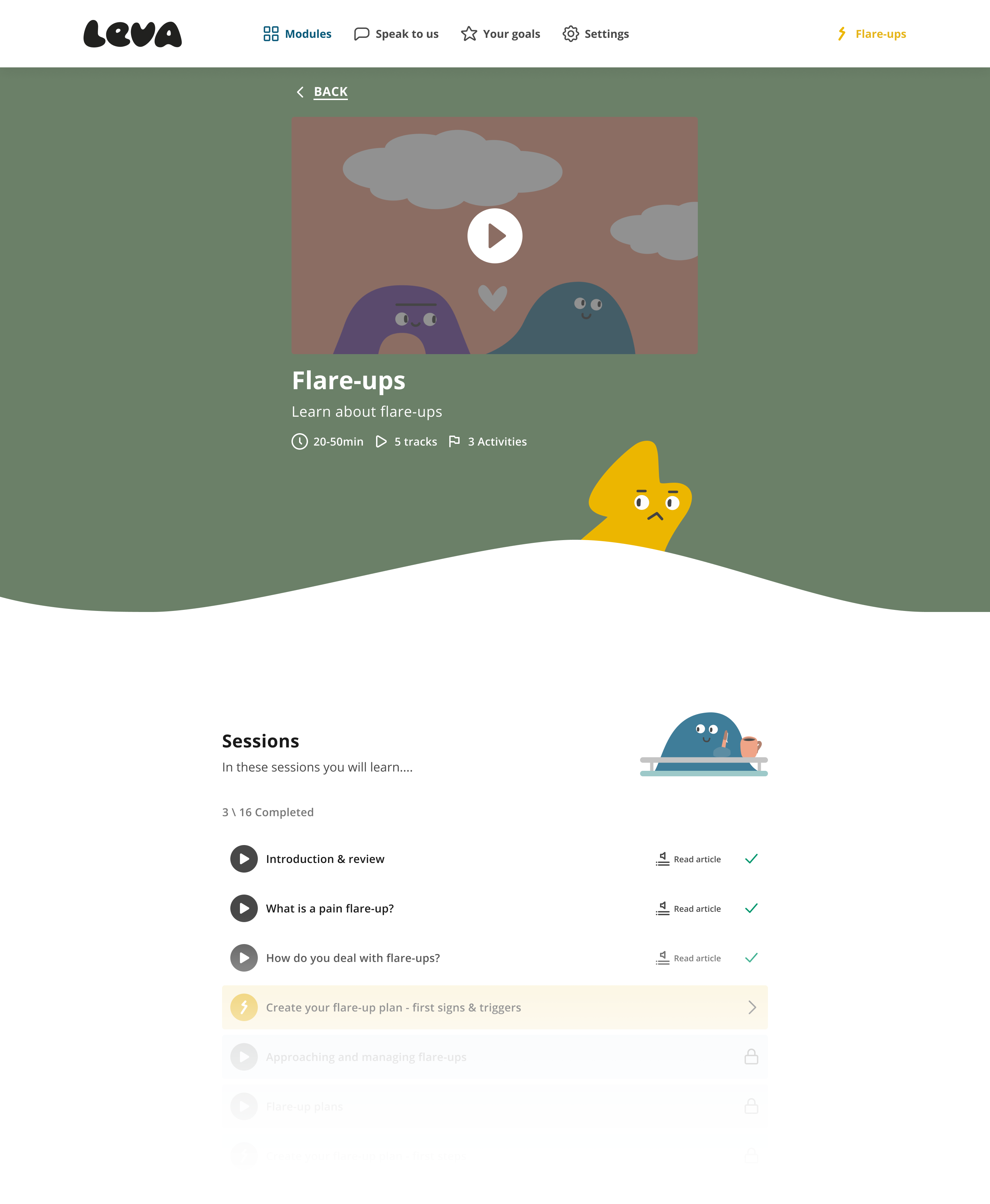
DIGITALIZING THE FLARE-UP PLAN
DIGITALIZING THE FLARE-UP PLAN
DIGITALIZING THE FLARE-UP PLAN
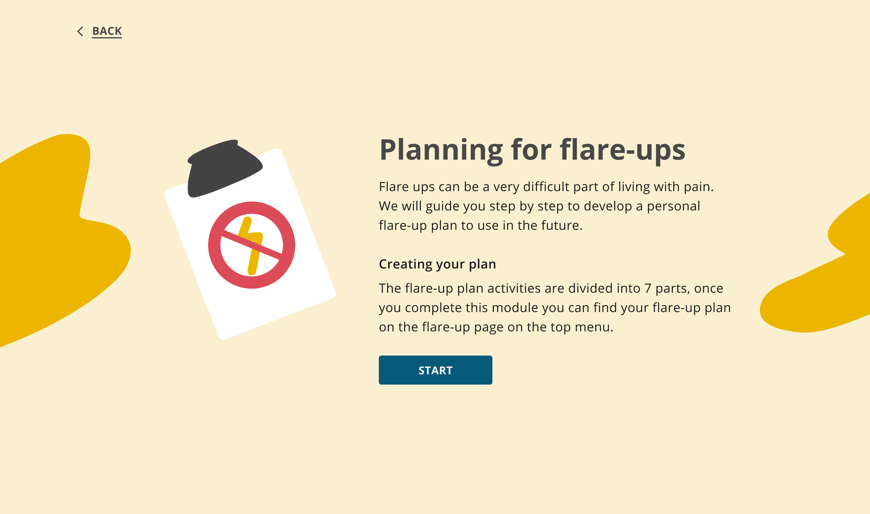
Helping in the moments things escalate
Patients with chronic pain experience flare-ups and these flare-ups can be very difficult and can deter them from progressing in the programme.
Before creating the digital flare-up plan the initial ideation evolved around creating a journaling feature to help users journal their feelings and thoughts at the end of the modules and increase engagement with the program. however, after further discussion, we decided that creating a more meaningful feature will help the users to be prepared in their harder moments and would increase engagement further.
What are flare-up plans?
What are flare-up plans?
Generally, a big part of offline pain programs and patient treatment is to create a flare-up plan. this helps the patients to be prepared for the flare-ups and set expectations on what will happen during the program as well as help them recover back and continue with a path to improvement.
Some examples of flare-up plans from different clinics
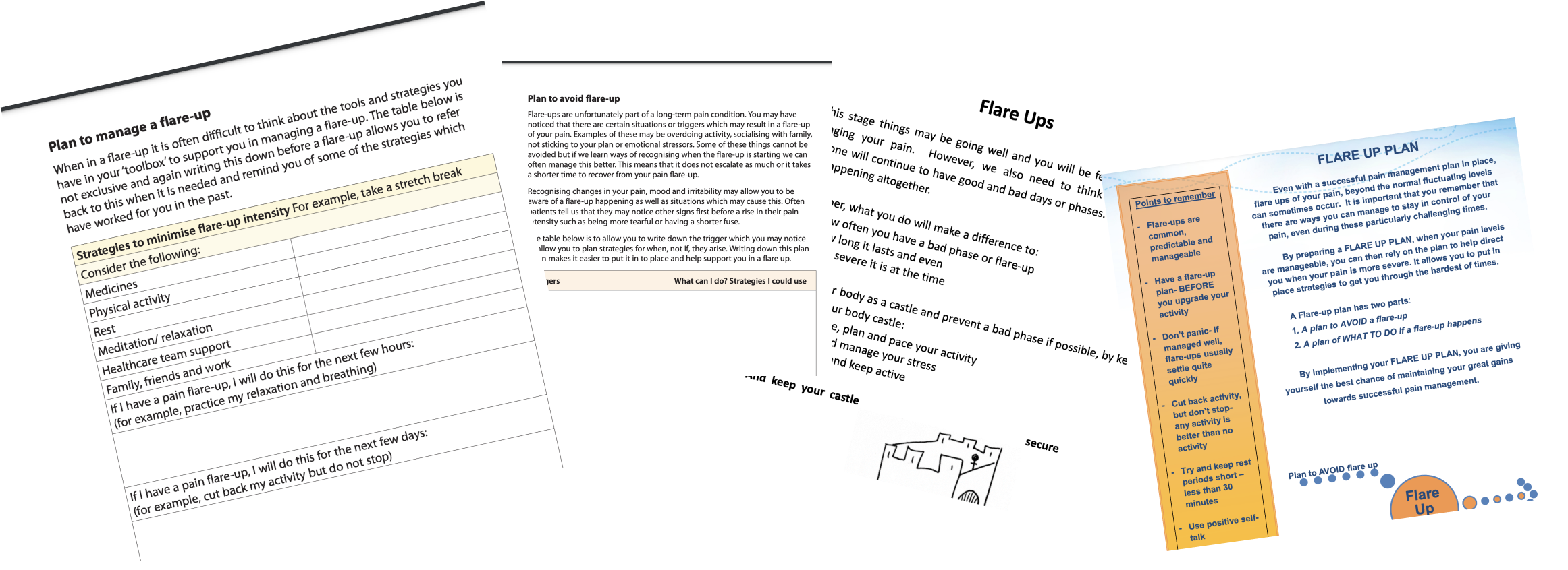
the process included desk research about flare-up plans, talking to pain experts at Leva and how they use flare-up plans, and talking to patients and their current experience with the flare-up plans. synthesizing the insights from all of this led to the idea to pace out the flare-up plan and relate each part to a different module. In the end, the user will have a dedicated section in the app they can always come back to.
So where's the digitalization part, ah?
So where's the digitalization part, ah?
The main challenges in creating the flare-up plan were catering to different types of information input and presenting “free form” information in a structured and easy way to scan and understand. i decided to let the users create “chips” at some parts of the flare-up plan to simulate a “list-making” that patients are used to when creating the pen and paper plan at the clinic.
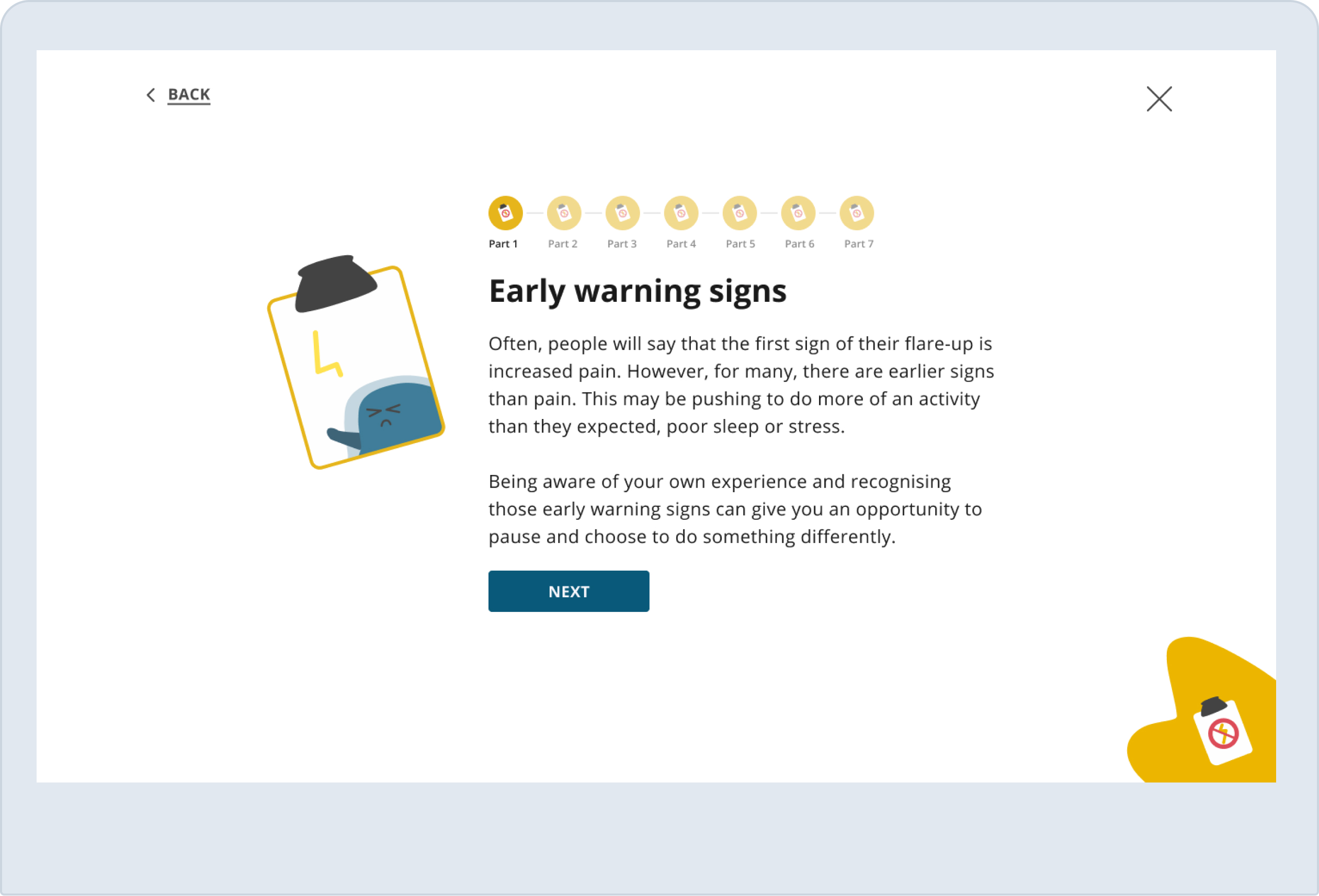
Each step started with an introduction to the reason and the goal for the user to complete the plan
Each step started with an introduction to the reason and the goal for the user to complete the plan
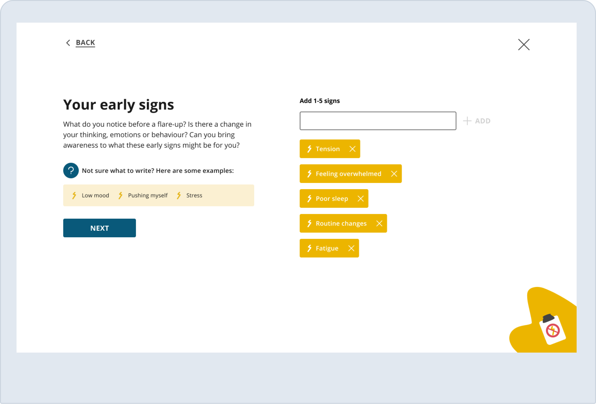
Some steps have a list type of input, we provided examples of typical things patients write to aid the users with what to note down
Some steps have a list type of input, we provided examples of typical things patients write to aid the users with what to note down
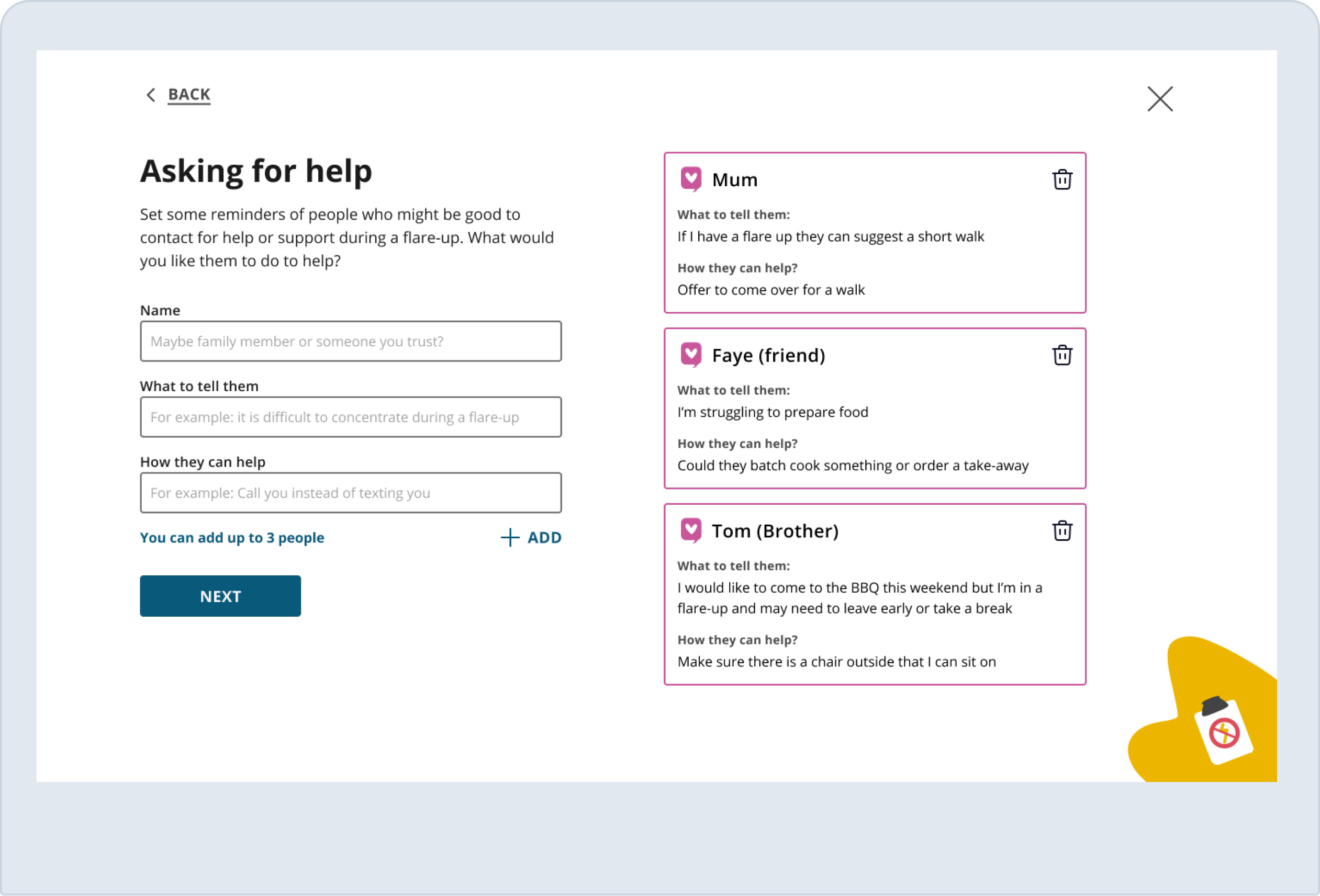
Some steps had a more complex type of input, the cards design is aimed to help break down the information to small and contextualize bits
Some steps had a more complex type of input, the cards design is aimed to help break down the information to small and contextualize bits
Something to relay on
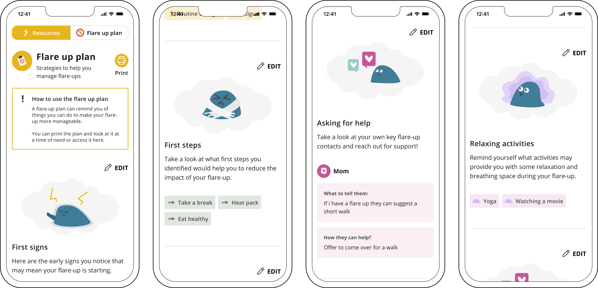
After completing each step the user can go back to their flare-up plan whenever they need and review what they noted down
SO WHAT DID I LEARN FROM ALL OF THIS?
SO WHAT DID I LEARN FROM ALL OF THIS?
SO WHAT DID I LEARN FROM ALL OF THIS?
When i started the design process i had no idea how diverse the experience of chronic pain patients can be. Suffering from different conditions means they all have different needs, and those need to be reflected in the design. Designing for people who might need urgent help while using the product made my approach very different.
I also learned a lot working with Arnaud and Oliver - working at a fast pace to deliver results and working on ideas, usability issues and systematic thinking on the fly was not an easy thing to do.
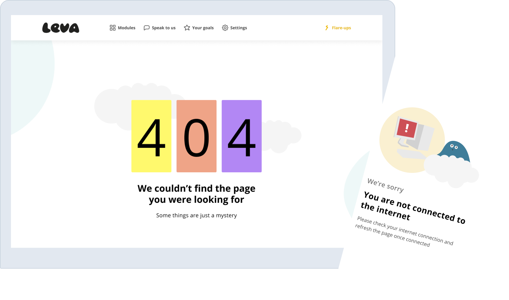
Oh, and i almost forgot!
I also got to do fun 404 and No connection pages!
This is a footer, why are you all the way down here? go back up!
© Idan Nesher, 2023