MY ACCOUNT REDESIGN
Improving the order overview, tracking, and cancellation functions on the Zalando Lounge website & apps
Improving the order overview, tracking, and cancellation functions on the Zalando Lounge website & apps
Improving the order overview, tracking, and cancellation functions on the Zalando Lounge website & apps
My Role: Design Lead, User Experience, User Interface
Platforms: iOS \ Android \ Web
Clientbase: 15M+
Activities
Problem discovery
Ideation workshops
Stakeholder interviews
UX copy
Quantitative research
User interviews & synthesis
Wireframes & prototypes
User interface design
Deliverables
User interface design
UX copy sheets
User insights presentation
Project documentation
Outcome
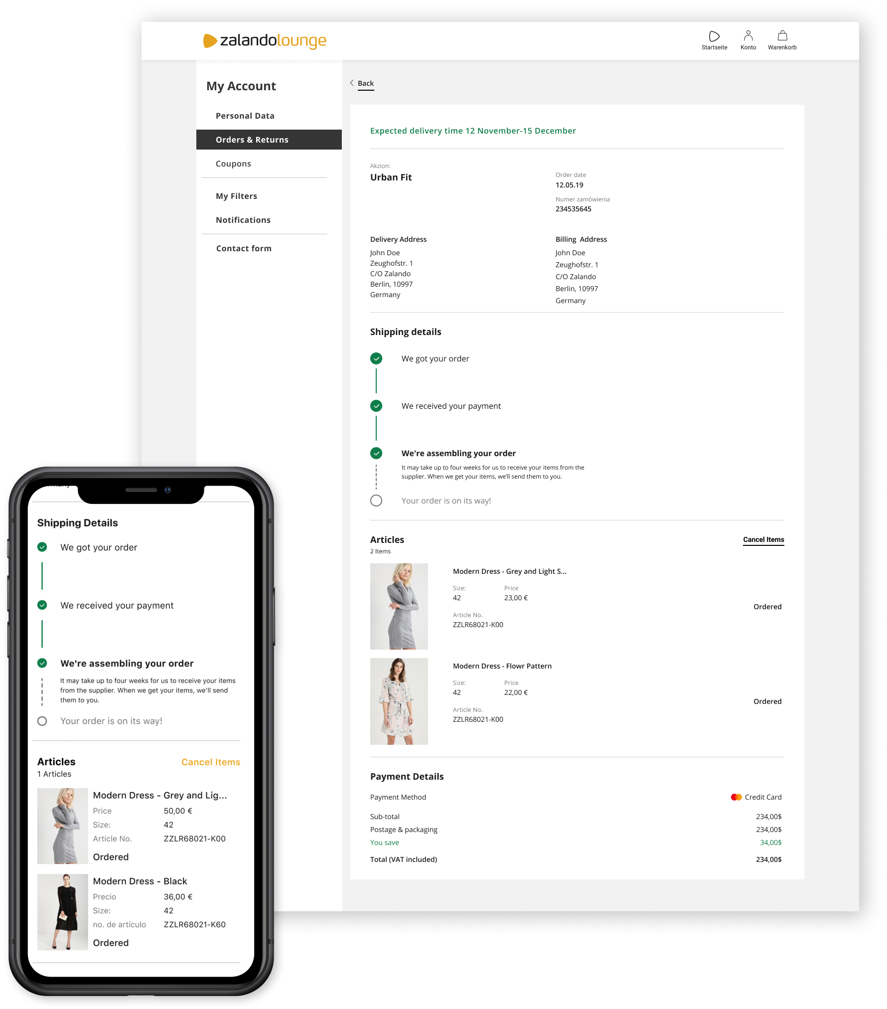
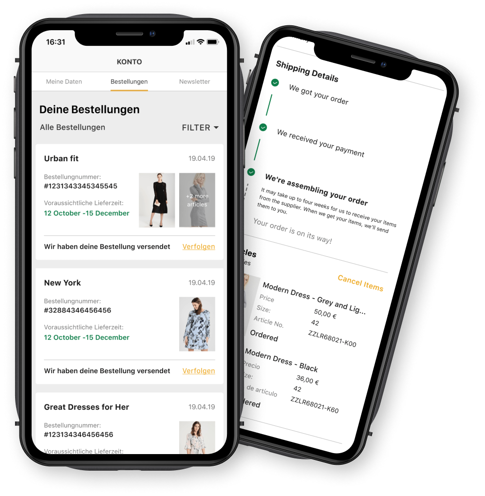
Fully implemented and live:
BACKGROUND
BACKGROUND
SO, WHAT'S ZALANDO LOUNGE?
Zalando Lounge is a shopping-club with daily campaigns that enable registered customers to shop from 2.500 selected premium-brands and top brands at a discount of up to -80%, Lounge operates in over 15 countries all over Europe. Zalando lounge currently has over 15 millions users
My Role
I worked as a Design Manager and as a UX Design Lead 2018 to 2020.
The Team
Our internal pillar design team included me and a junior designer - Christine Chin, since this was Christine’s first role as a junior UX designer I mentored her through our work together. we also had at our disposal the help of Javier Vidosa, who's a User Researcher.
In the last year, we also had the privilege to work with a UI designer - Wais Akbari, due to our growing project capacity.
What Did I Work On?
What Did I Work On?
Through my time at Lounge, I worked in several teams and I lead the design efforts to redesign My Account, checkout, return and cancellation flows, delivery methodologies, and covid-19 response strategy.
Project
ORDER HISTORY & CANCELLATION
ORDER HISTORY & CANCELLATION
ORDER HISTORY & CANCELLATION
ORDER HISTORY & CANCELLATION

Why Was This Project Important?
What do you feel like when you look for a job?
The Account section has not changed since the company started 3 years prior and was increasingly outdated.
We planned the account section redesign in parts and first, we decided to start with the order history and
some important features that were not available became increasingly pressing to integrate into the account section - such as partial cancellation and easier method of tracking orders.
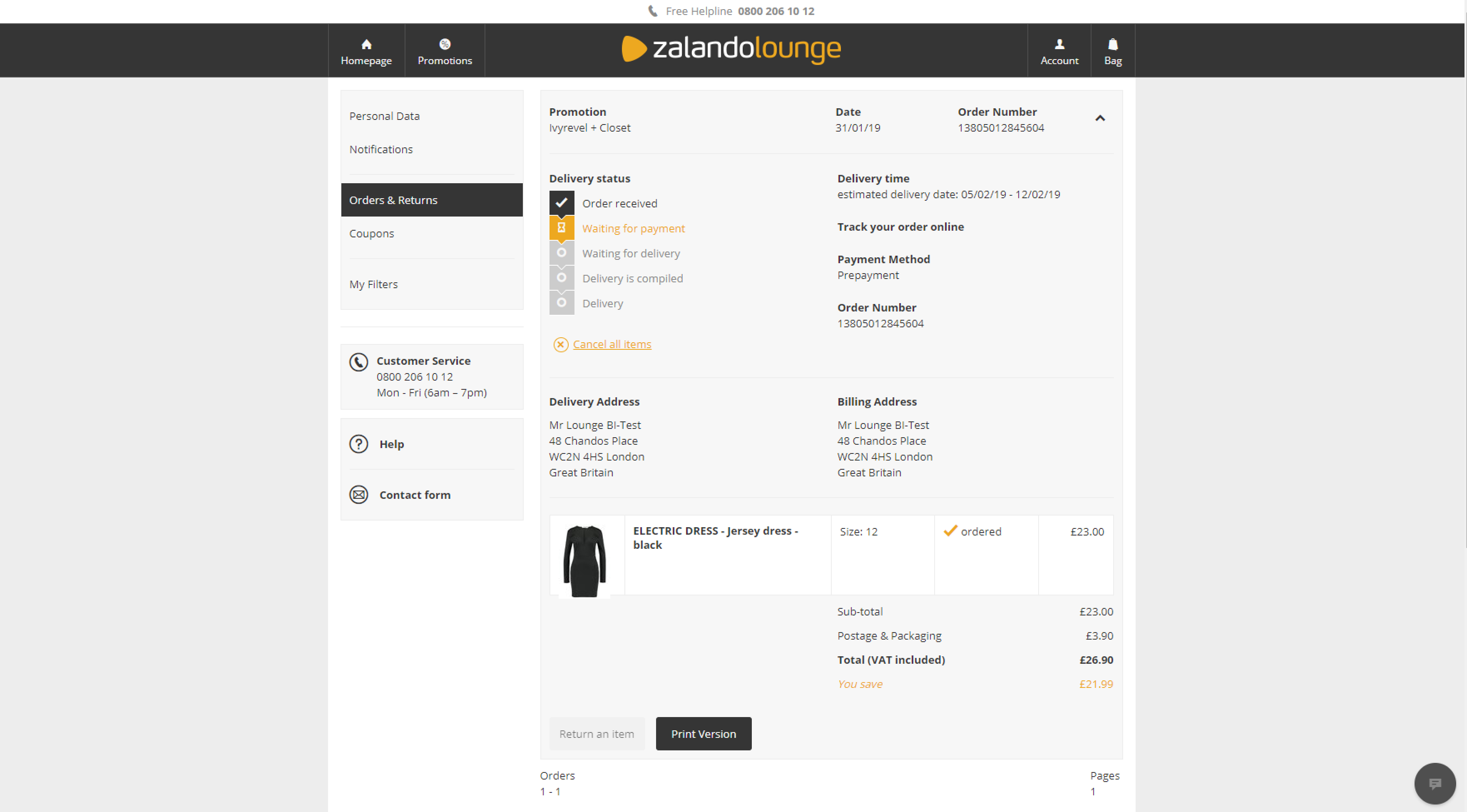
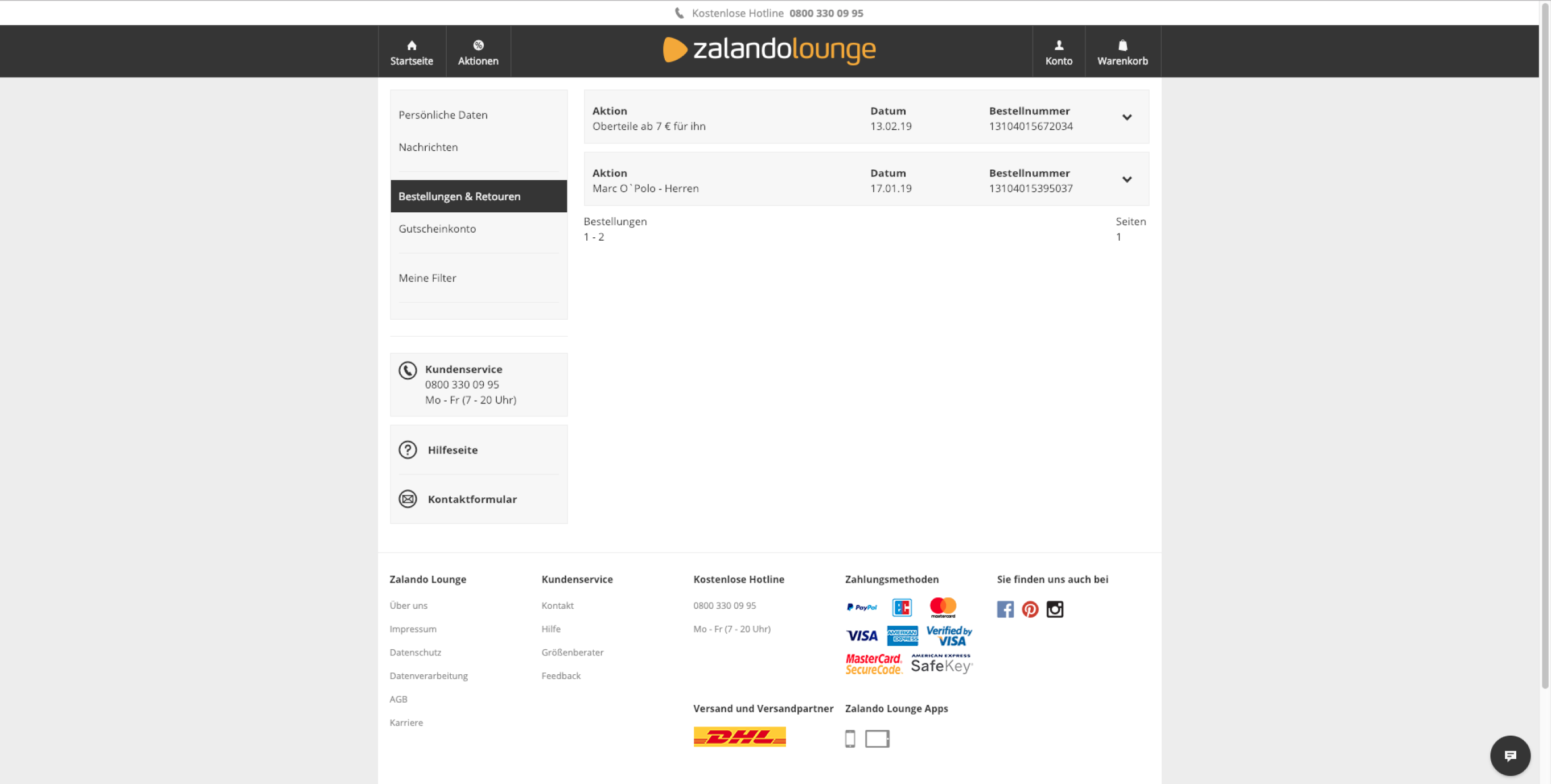
The current designs for order history and details:
What We Wanted to Achieve
What We Wanted to Achieve
We wanted to improve the way users track and view their orders, improve the UX copy to help our users track and understand errors and find what are the most important issues we need to improve in the order details to help our users to make a better decision regarding canceling their order or not.
It was also an opportunity to add cancellation per item (partial cancellation) and not per entire order, which was not possible technically until then and created a lot of pressure on the customer care personnel.
CHALLENGES
DEFINING THE METRICS
1 →
Craft a UX copy that will fit all markets and over 7 languages
2 →
Align our designs within the current ecosphere of the account section
3 →
Strategize how all parts of the account section would fit within our growing Design System
THE PROCESS
THE PROCESS
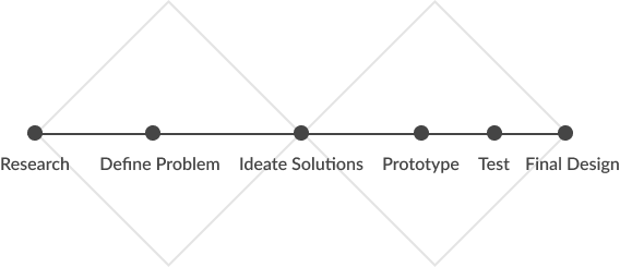
At Lounge, we follow a double diamond process in all our projects, starting with the discovery of our problem, which included market research and user interviews, desk research, and competitive analysis, and stakeholder interviews.
After analyzing these insights, we began to conceptualize the solution by identifying user flows, journies, and wireframes.
Then we moved to prototype our proposed solution and reiterated according to our user’s feedback.
DISCOVERY
What Do Our Stakeholders Think?
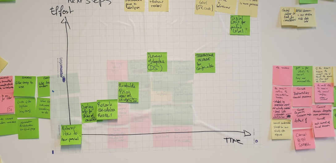
In order to understand the problem from our internal team, I conducted a short problem collection workshop with our 3 main stakeholders - Customer care, Business development, and logistics, in order to understand their motivation for the redesign and their initial insights about our users.
This also gave us a good idea of what’s possible and what’s needed and how to prioritize features.
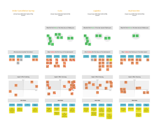
From the top: what works, what doesn’t work, impact effort and HMU statement \ next steps
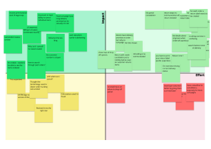
The final impact effort chart from all 3 stakeholders, which helped us to prioritise on what features to focus first
Desk Research
Conducting competitor analysis help to understand what some of our competitors are utilizing on their order overview and order details pages.
We created spreadsheets and screen matrixes according to different platforms in order to have knowledge of how our users experience other e-commerce shopping clubs and websites.
We aligned to current Baymard reports, who does extensive e-commerce research worldwide, on benchmarks for order overview, details, and cancellations features
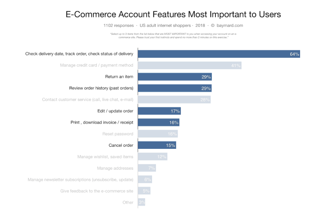
for most users, the key details needed to track an order are the delivery date, the name of the courier company, and the sub-events or stages of the order delivery process.
Quantitative Research
Our research department conducted market research to understand the desirability of the partial cancellation feature and discovered that 60% of the users find it crucial to have the option to cancel only part of their order.
we also discovered that since we do not offer partial cancellation at this point most of our users cancel their entire order even though they only wish to cancel one item or so.
overall 85% of our users were satisfied with the way they could cancel their orders on the account section.
we also looked into the available quantitative data to understand the number of items users usually buy in one order, how many users use the cancellation option, drop off rates, etc.
What Our Users Think and Need?
We created a user flow for each country & overall user journey for the order cancellation to help us understand the logic behind our current flow and how we can evolve it further.
What does the user think & Feel during cancellation:
What does the user think & Feel during cancellation:
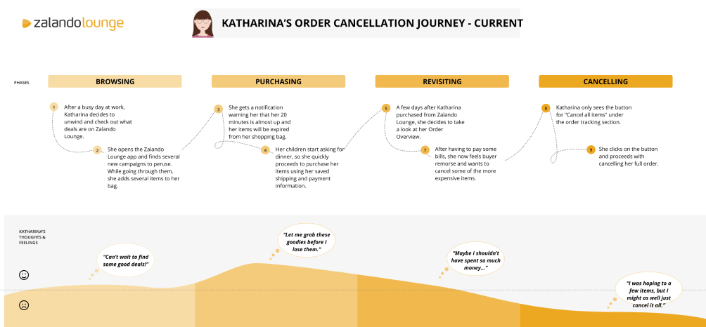
The order cancellation user journey:
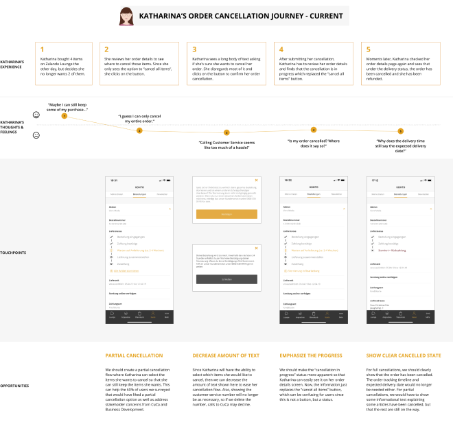
DEFINITION
DEFINITION
Information Architecture
To determine how to prioritize the hierarchy of information shown on the order details page, we determined the reasons why customers would come to this page and identified the pieces of information that would help them achieve their goals.
Customers may visit the order details page for the following reasons:
- To track where their order is and when it will arrive
- To cancel items or the entire order
- To return items or the entire order
- To review the items they purchased and how much money they spent.
In order to help our customers achieve their goals, how might we present the information they require in an understandable and clear manner?
In order to help our customers achieve their goals, how might we present the information they require in an understandable and clear manner?
In order to help our customers achieve their goals, how might we present the information they require in an understandable and clear manner?
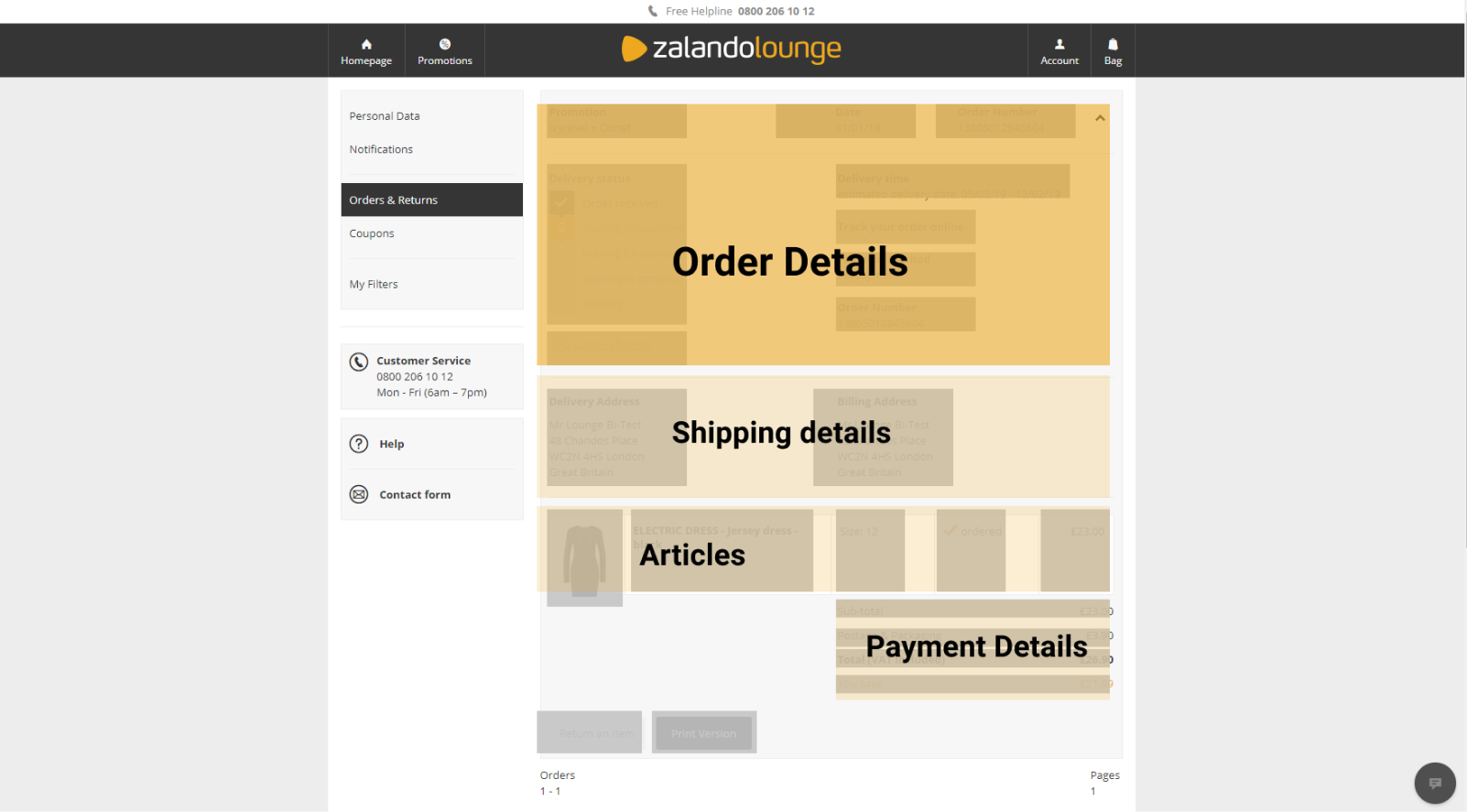
We decided to group each part of the order overview and order details in order to help us section it better:
General order details - date, order number
Shipping details - delivery date, order status, shipping address
Article details - images, description, price, quantity
Payment details - Payment method, billing address
Order summary - total price, VAT, discount %
Each section has examples of what information may be included, but it does not necessarily mean that information has to be placed within the section (for example, the expected delivery date may be emphasized at the very top of the page, separate from other shipping details).
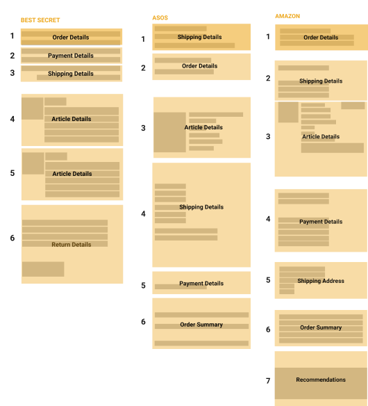
We then reviewed some of our competitor's layouts to see how they were organizing information and created wireframes to represent the way they prioritized information on their order details\overview pages.
Our current information clustering:
Our competitor's information clustering:
Wireframes
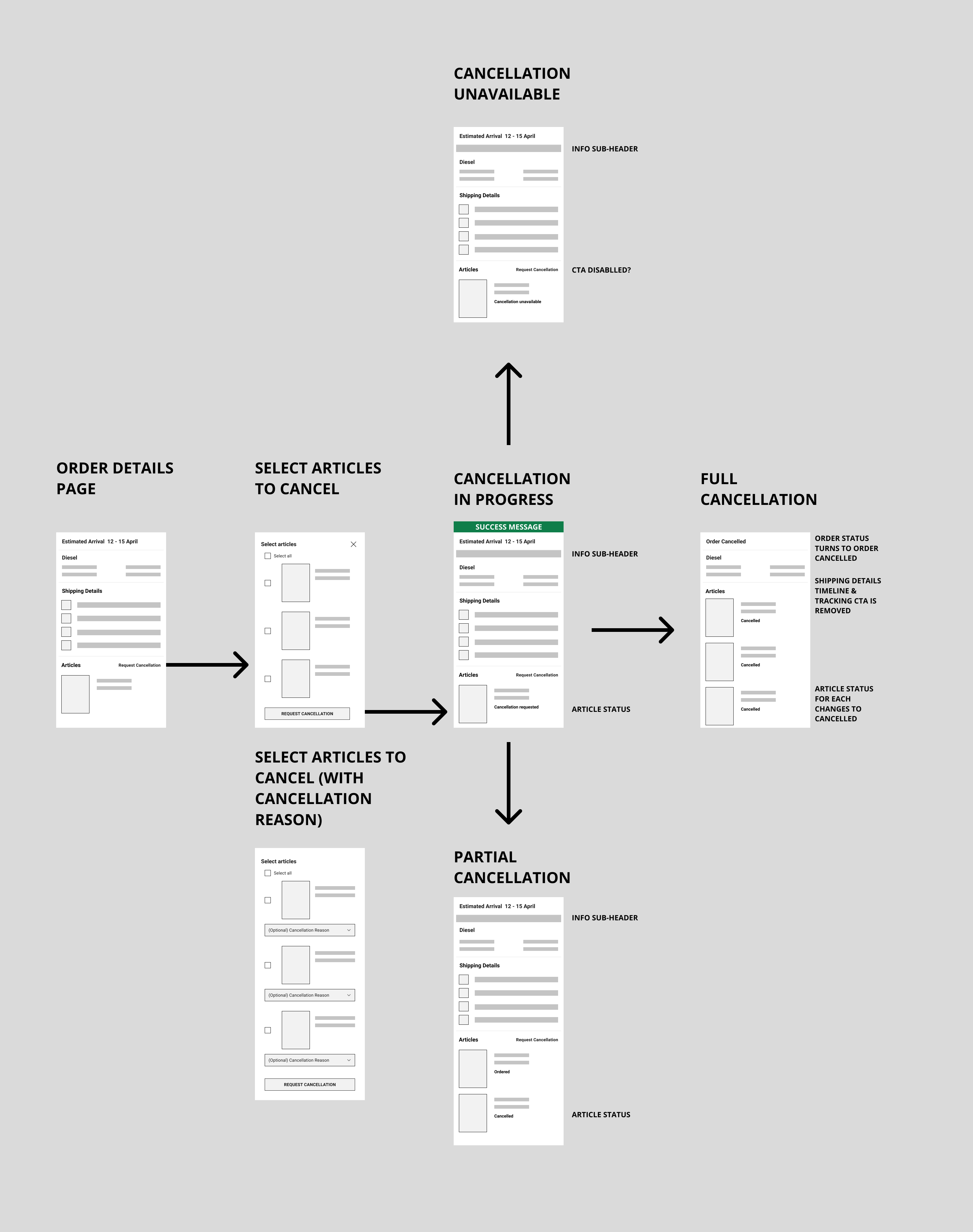
We continued to create several wireframes and user flows to ideate on the components and overall logic of the screens.
for example the user flow for article cancellation:
TESTING
TESTING
Copy and Language
Using clear depictive terminology that represents Zalando Lounge’s brand voice in My Account is extremely important because customers come to view their Order Overview post-purchase,
and We need to continue to provide the type of relationship they seek even after their purchase.
we started to ideate on better ways to explain our order status and when the order is arriving and generated dozens of UI variations
Design & Testing
Design & Testing
We conducted a user test for our 1st iteration of the proposed copy and visualization
overall we tested 3 ideas:
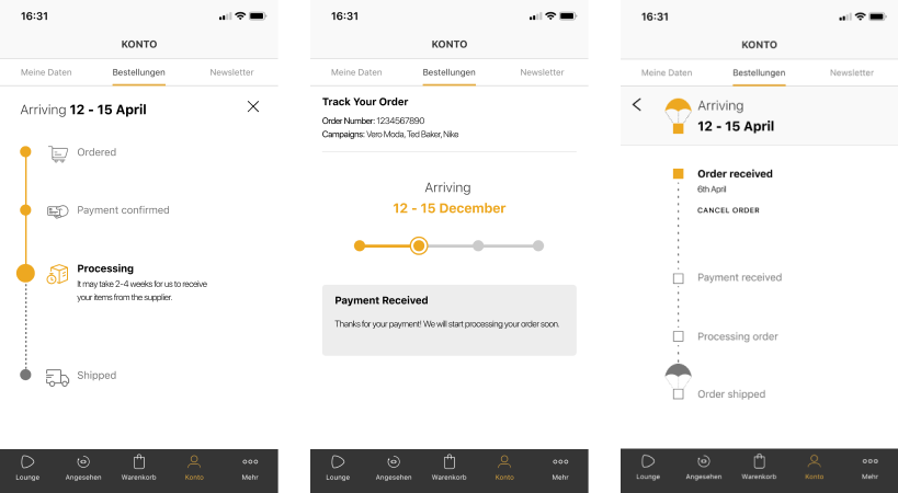
From our user feedback, we learned that users found the delivery time on the top of the screen to be the most important and clear information, other than that they found then the vertical visualization is the easiest to follow
We then iterated on our designs and conducted a second round of testing on the following screens:
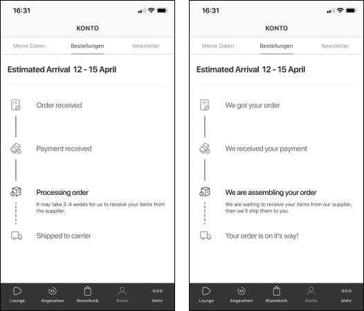
Some of the feedback we got on our first test:
- Some users were a bit confused regarding the waiting time during the order assembly
- The majority of users preferred the sentence structured states rather than the short states, it sounded to them more friendly and helped them understand the state much better
- The majority of users said the icons confuse them and would rather have them removed
On our final iteration we changed our tone to be even friendlier and explained in more details what happens while an order is in assembly with the help of the logistics team:
Order Cancellation
Overall we did 3 rounds of prototype testing for the order cancellation flow, here are some of the feedback we got from our users:
Cancel states are not clear on order details
Users were confused about whether their cancellation request went through or not since some articles took longer to switch from “cancellation requested” to “canceled”
Missing cancellation success communication
Users indicated that they needed more feedback and the end of the cancellation flow about the next steps and if it went through or not
The cancellation reason drop-down was not clear enough
Users indicated that they needed more feedback and the end of the cancellation flow about the next steps and if it went through or not
OUTCOME
OUTCOME
User Interface
Some of the interface design challenges we had to tackle:
- We needed to create new components for our growing design system
- We had to work with a new fixed grid and space measurement system that had been aligned with the rest of the product teams and handed over using visual measurement guides to our developers.
it is my experience that creating a Q&A meeting with the developers is crucial for the success of the implementation, and those meetings were crucial for our developers to understand several logic details, error states & designs, interactions, and more.
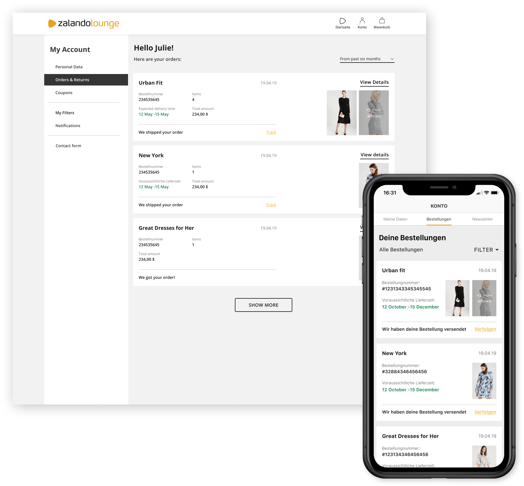
Order History
Designed and implemented on iOS, Android and Web interfaces
- Users managed to understand and scan their orders better
- Users can easily find the order number when talking to customer care employees
- Having a more prominent order tracking and order status has decreased the number of callers customer care receives
- We added a search filter and additional info that was not available before
Order Details
Designed and implemented on iOS, Android and Web interfaces
- Redesigned information hierarchy to improve scanability and functions
- Improved tracking copy and infographics reduced the number of calls to customer care
- Cancel and return actions are easier to find
- Added order status per article reduced the number of confused users regarding already canceled or returned items
